Project 2 - Fragments
♥ ♥ ♥
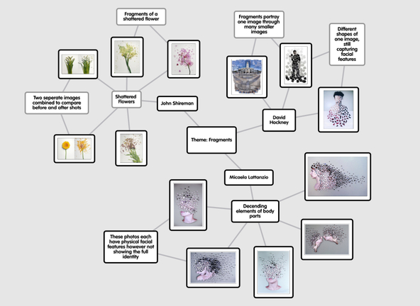
Photographer mind map:
This image is my photographer mind map, portraying specific pieces produced by either John Shireman, David Hockney or Micaela Lattanzia. These will be the 3 photographers whose work will have impacts on what I post on this page as they will inspire what I create. This image is also to refer back to their own work to compare both my pieces and theirs together in order to have succeeded in my own interpretations.
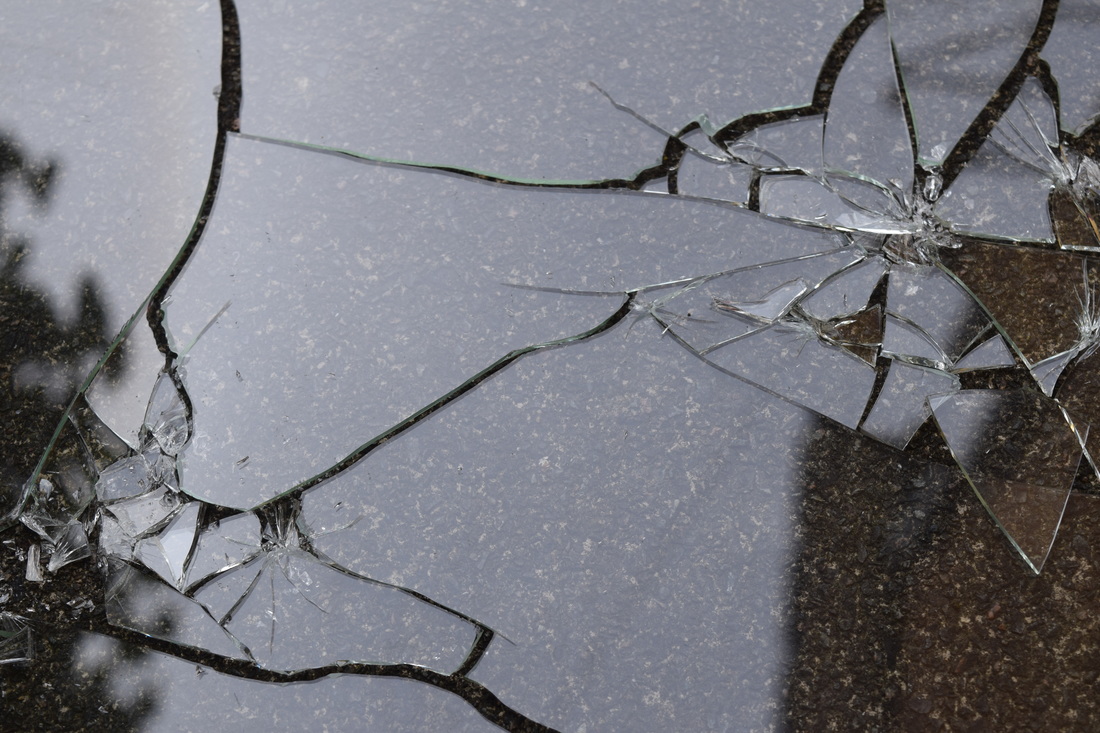
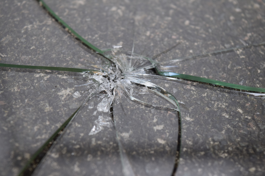
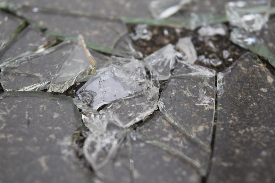
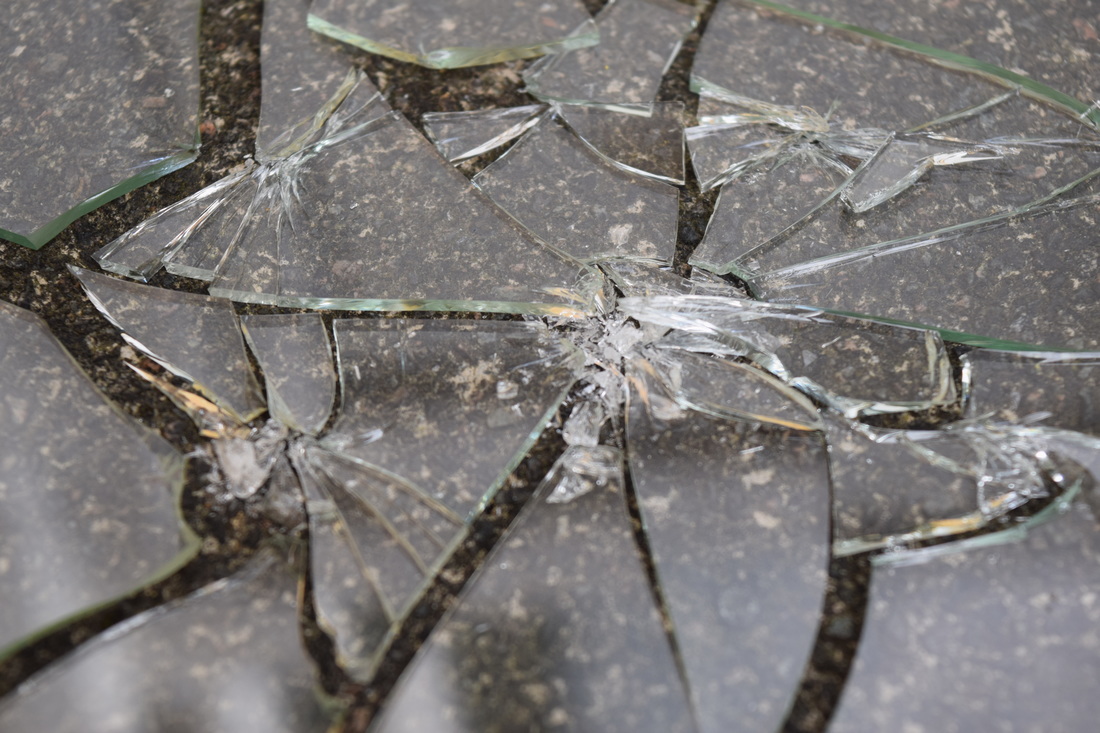
Analyses: ♥ ♥ ♥ Fragments
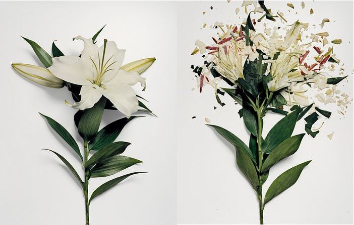
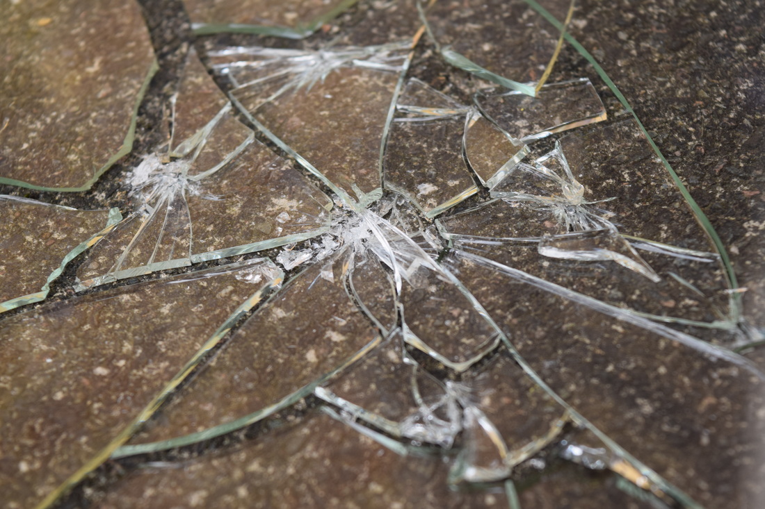
Analysis of John Shireman
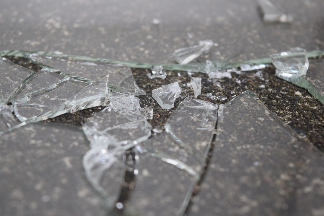
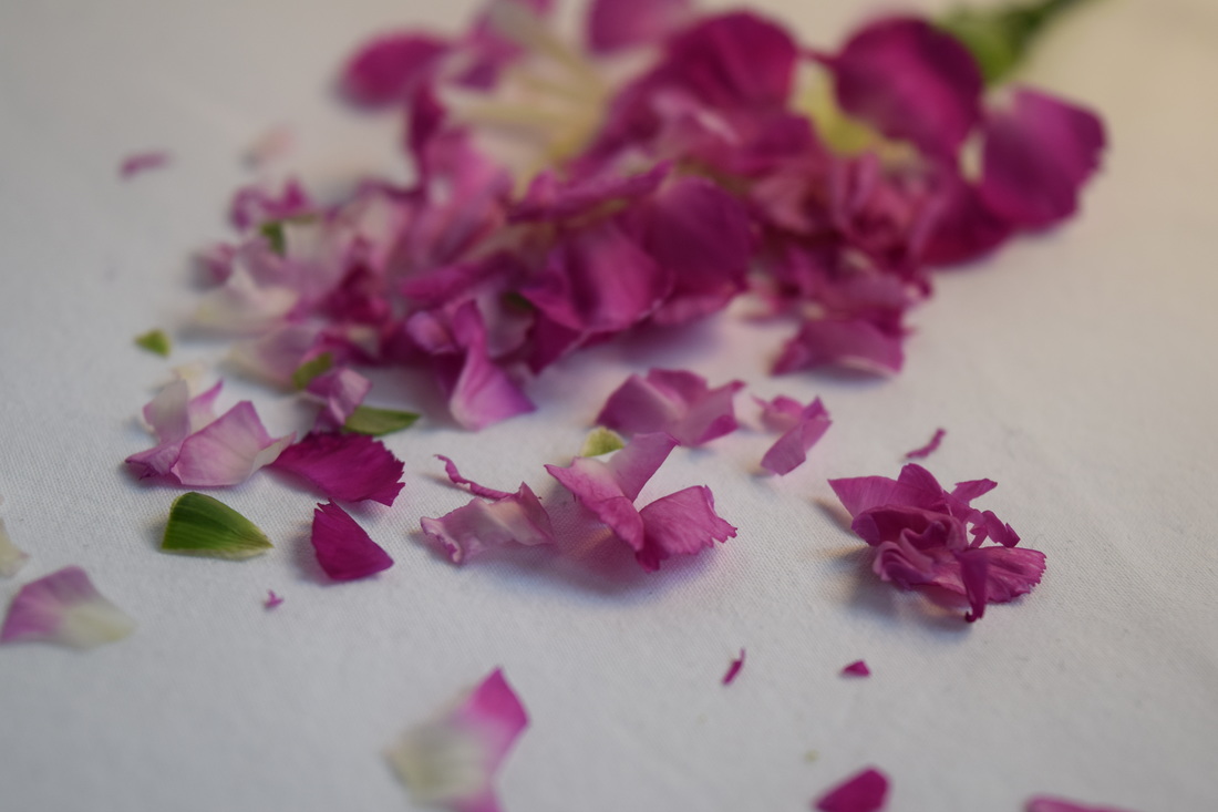
In the chosen image, I can see that one half of the photograph is showing the full flower without any modifications done to it, whereas on the other half I can see a fully damaged, shattered bouquet of flowers with fragments of leaves and petals sprawled across the page. If I was to describe this photo, I would use words such beaten distressed and battered as they are all words with violent meanings. It portrays a message, what was once and powerless object has now been crushed helplessly. This image is a very natural photo as its main focus is on the flowers itself as they are a part of the environment, however has been manipulated in the sense of lighting and background which helps the flowers to appear clearer.
In order to achieve this image, Shireman may have used equipment such as a hammer to flatten the plant in order to fill the frame, also using scissors to cut up each petal to tiny pieces in order to complete the aim of fragmentation. This has an effect on the photo because it completely changes the aspect and meaning of the original photo. What interests me most about this image is the fact that flowers hold their beauty within the petals and how they vary with different colours and seem so innocent, but it is so easy to take that beauty away and can be destroyed effortlessly, as shown on the right image.
The majority of the flower in both images are in the frame, and there is a little bit of space around the main object, so that it instantly draws in the viewer’s eyes to the centre where the object is situated.. In the image, the part that strikes me the most is the flowers itself. The colour of the flowers is very plain yet bold and effective. I also like how aggressive the adjacent image is from the explosion of flower petals, scattering them across the spaces where nothing is being used. If I had to ask any questions to the photographer who staged this piece, I would ask what his inspiration was that made him want to destroy such a delicate item and how he achieved this process.
This picture gives me an instant feeling of aggressiveness due to the destruction caused on the second photo. I think the message that Shireman is portraying if of innocence being destroyed which he has clearly portrayed within his work. This leads me on to thinking that the message may be about innocence and how it can be damaged abruptly. The point in creating this image was to show aggressiveness in the form of a helpless object, almost representing the personality of a human; one side is innocent and kind and the other is violent and hostile, making the image effective.
By Sophie Adams
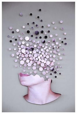
Analysis of Micaela Lattanzio
This image was produced by Micaela Lattanzio in 2014 and they have titled their line of photography as ‘Fragmenta’.
In this photo, I can see many varying sizes of hexagons, each having facial features of what once was a human portrait carefully placed across the page. In order to describe the photograph, I would use words such as unique as I have not come across this type of fragmentation photography before, mainly the reason why I decided to analyse Lattanzio’s work. There is no specific shape to this persons face as it has been disarrayed; giving the impression that it may have exploded. This piece is an abstract photo as Micaela has taken the image and modified it herself, making it unique and different to any other fragmented photos as it is her own style of work. By looking at this individual image, I notice the chin structure of a human, whereas everything else has been almost scattered across the page unevenly, yet still seeming like it has structure.
Micaela Lattanzio cuts apart portraits and then builds them back in various new forms. She takes the small pieces she has cut and then reconstructs them into something completely new. If looking closely, we can see faint shadows coming from each individual piece of the original photo indicating that they have been raised form the canvas she has used. She does this by taking each piece and pins them down to her chosen canvas, forming a new composition. In many of her creations, the fragments of her portraits seem to disperse upwards.
“Lattanzio uses the fragments to create striking split images as though in dialog with the viewer or with itself. It’s as if the technical process of destruction and reformation used in this work is a reflection for one’s own feelings of fragmentation and a shifting sense of identity.”
The shapes vary in this photograph as they scatter upwards and each fragment carries some identity of the original portrait. There is a range of dark and light colours in this image, creating an interesting contrast as the pieces are put next to each other. I can also notice that towards the top of the image, smaller pieces have been used and have been spread out whereas, near the middle of the page where the pieces have ‘broken’ from the face they tend to be larger and tightly packed in one area. This picture is different from real life as a human head is not structured in this composition, clearly modified to Lattanzio’s liking. This leads me on to what I find most interesting in Micaela’s work. Personally I like the colour scheme within her whole scheme of work. Compared to her many other pieces, they all carry the same similarities, they are all of women and the same lighting has been applied throughout. Neutral tones and colours are shown within Lattanzio’s work giving a modern feel to their work.
Micaela has kept the shape of the outline of the original portrait, keeping the majority of the image in proportion as some of it has been more exaggerated to fit the purpose of her scheme. The part of the image that strikes me as most interesting would be the fragmented bit itself. This was purposely the most eye-catching part of the image, therefore making it the most appealing to viewers. If I was to personally ask the photographer a question based on their work, I would ask what would have inspired her to produce such a unique piece of work.
This photograph is effective due to the colours and background involved. The colours blend together well and some of the darker shapes emphasise certain areas more and highlights key areas that the artist would want people to look at. If other people were to look at her work, I think that they would also feel it is very effective in terms of colours and shading, as well as being and abstract piece altogether. Something that is worth remembering about this photo is that there are so many different ways that this work could be reconstructed and interpreted as it will be a new image every time.
By Sophie Adams
Analysis of
David Hockney
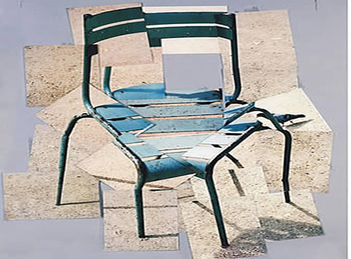
The photo I have chosen to analyse was produced by a photographer called David Hockney, and his theme is Fragmentation.
As his theme is based around fragments, there are many angles and individual pictures of one specific object, and in this case it is a chair. I would use the worse creative and abstract to describe this image as Hockney has taken many angles of the same object and put them in a from where we can still identify the object itself, but in a new formation.
The way in which this piece of work was created was by Photoshop, as he has taken each individual image and layered them over each other. It affects the way we interpret it because we although by some clear aspects of the photo, we can tell that it is still a chair but changing the perspective we see. This entire image is in focus so that we can identify what the main objective is about, which is just obviously a chair portrayed in different angles. There aren’t any obvious patterns of textures of which I can identify as this is mainly just a natural photo. The photographer has captured natural light in this image as we can see shadows and some areas are brighter than others however I think this may be because of the different angles he has taken each photo of. This photo could be argued that it is different from real life as we know that this is not what a chair looks like as it has been developed and transformed into a different view of a chair by the individual images as fragments of one image. What I like most about David Hockney’s work is work is always a different interpretation to what the object actually is, which is interesting and unique.
What is most effective about this image is how he has placed and layered the images together as they create the illusion of the chair itself however with a different view and perspective. If other people were to see this image also I think they would also say that it is abstract and unique. I think this because they are the first words that come into your head when you first see this image.
By Sophie Adams